Since my research project is going to be related to Data Visualisation, I thought that I should have a go at trying to do some of my own data visualisation, in my own style.
I considered various possible data sources and how I might interpret them. The fun thing about it is that the data can come from anywhere. I don’t need to limit myself to any particular type, source, or genre of data.
One possible source of data could be music-related data since I work in the music industry. You may be surprised how much data is related to a single piece of music. For each individual track we hold 153 pieces of data attached to it. These range from the obvious like title, artist, duration, to descriptors like the genre, mood, theme, to elements of the music like instruments, tempo, lyrics, to creator information like writers, publishers, etc. We have almost 200,000 tracks so that is over 30 million pieces of data.
Perhaps I could do some kind of comparison of beats per minute per genre, or get more obscure like how many explicit tracks use a bassoon. There are a lot of possibilities but the great wealth of information available was overwhelming.
I considered using the waveforms of music which I think are beautiful:

And I remembered that I have actually done a version of this already, which I titled Frequency:

This is acrylic on canvas, approximately 90cm x 60cm. It’s hard to tell from the photo but the lines are a mixture of greys, blacks, and some silver stripes.
Still I wanted to make something new, and I decided to start simply. What is a basic but beautiful set of numbers? I thought about mathematical sequences like Fibonacci or Prime numbers. Then I thought about the number Pi and its infinite decimals. Here are just the first 50 digits:
3.1415926535897932384626433832795028841971693993751
This led me to create a simple but effective pattern of corresponding circles. I measured 1mm for each number, with 5mm between each ring. This is the result:
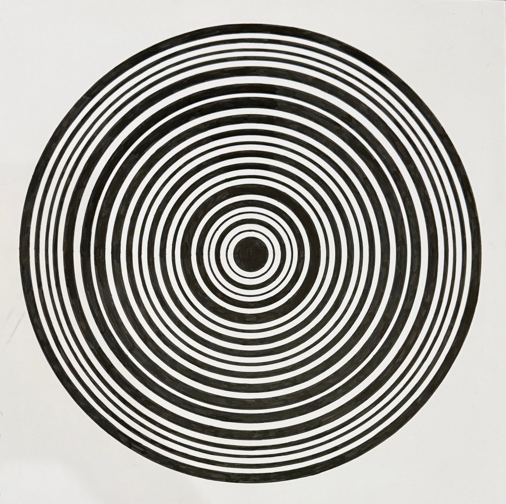
This was done with ink on paper, approximately 40cm x 40cm. It is simple but effective. The more I look at the more the circles seem to move and change.
As I was making it I thought maybe it is too simple and it won’t be effective, but I love the end result. I’m now considering what it would be like to create a much bigger version.
To me, data is interesting. Interpreting it is challenging but rewarding. And simple can be beautiful.

Leave a comment