In conjunction with my research project, I am working on creating my own art pieces using data as a medium.
I have many ideas for what the data could be, and they all have a common denominator, but that will be revealed in due course. For now I am exploring what type of data I can get access to, and how I can represent it as art.
My main aim is that that what I make are engaging pieces of art that stand on their own as something intriguing (and hopefully beautiful) to look at, even if you don’t know that data plays a part. It is also essential that the art doesn’t look like an infographic or something created by AI.
For example this is a piece of art by Nicholas Rouguex that represents data from Classical music:

It is a beautiful composition on its own, but the fact that it is based on the musical notes makes it more intriguing.
For myself i intend to use numerical data points to explore and illustrate the topic. I have been looking at many different sources of data and have been surprised at the wealth and breadth of data available.
One big source that I have been working on this week is the government run Office of National Statistics (ONS) which publishes an enormous array of data across many areas.
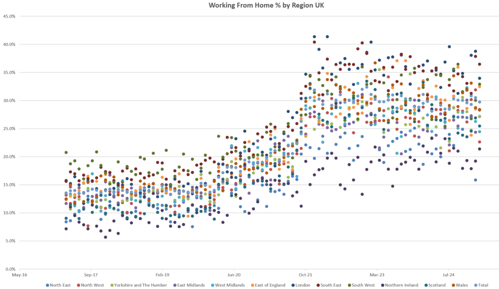
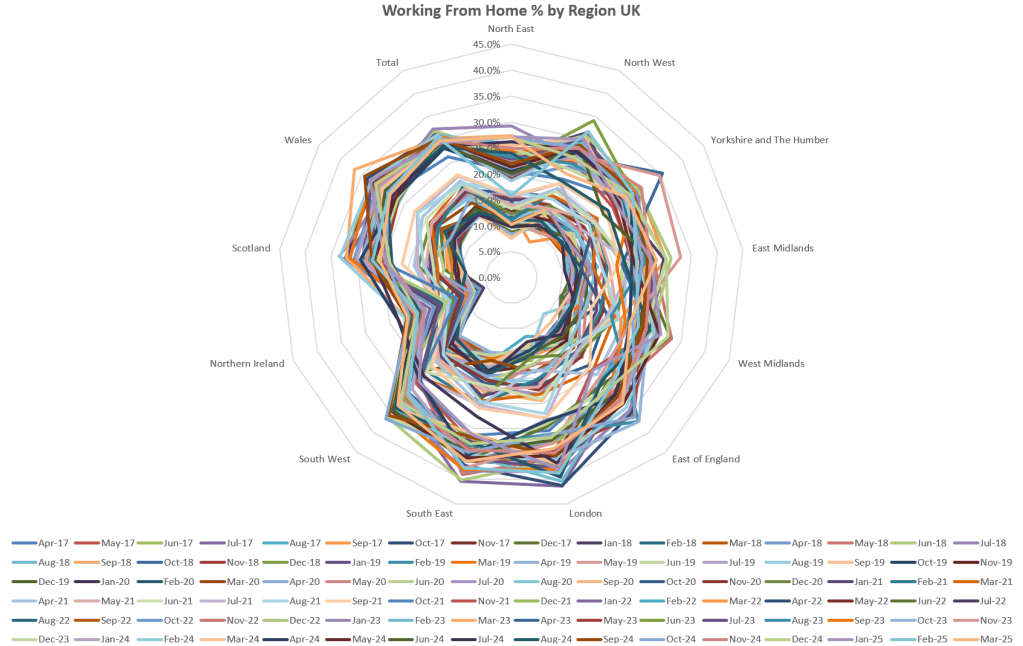
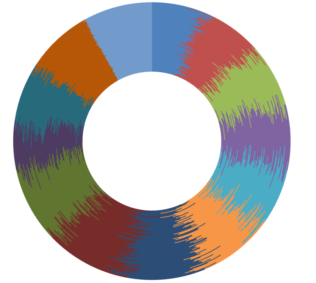
I downloaded the data on homeworking since 2017. I’m thinking of how I can represent this as a piece of art. I already have an idea of how to do it but first I’m using Excel to see how different charts can display the data, hoping to get an idea of how the data could be shown.
Here are some interesting options:
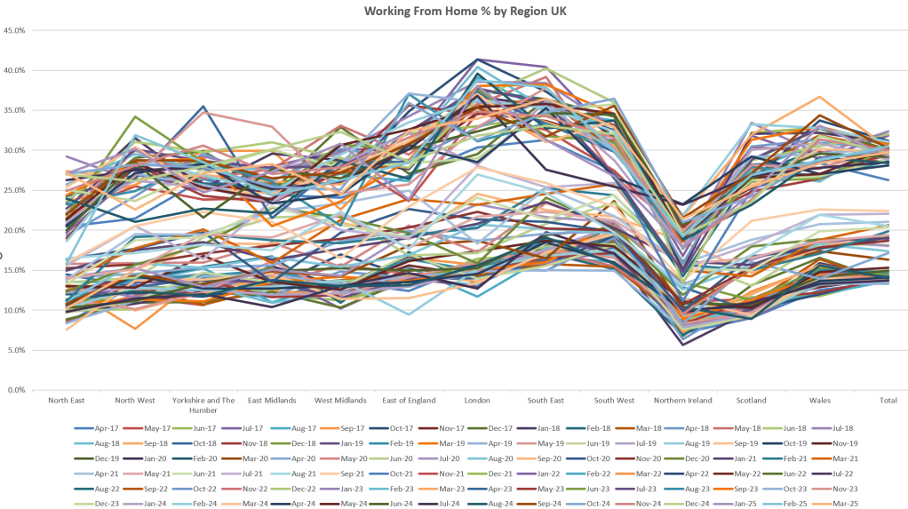
I liked this one above in particular, because if you ignore all of the text and numbers, the central form is quite beauiful:
This was another option that Excel offered:
I’m sure if I ran the data through an AI tool, it could make something amazing, but that is not the point of what I’m trying to do. I don’t want something that would work well on a powerpoint slide. My end result is not intended to be part of a board meeting unless it’s on the wall as a piece of art in its own right.
I’m actually working on creating something more collage-based to interpret this data, but let’s see whether what is in my head will translate to something beautiful, or at least interesting.

Leave a comment