One of the two main data visualists I am researching for my paper is David McCandless. He is a British author, designer, and “data-journalist.” Originally working on gaming magazines, he found a keen interest in displaying information in unusual and engaging ways. This led to a blog called “Information is Beautiful” that eventually led to a book.
In 2009 he released a book titled “Information is Beautiful” which is largely a collection of his most intriguing and thought-provoking data visualisations.
Originally he first pitched the book with the title of “Information Maps” and received little interest from publishers. This led him to change the title to “Information is beautiful” which scored him a book deal.
The book was then a surprise success for both David and the publishers. He followed it with “Knowledge is Beautiful” in 2014 and “Beautiful News” in 2021.
David now has a whole team who help run the “Information is Beautiful” website that continues to create and publish intriguing examples of data visualisation. It has created something of a movement amongst data professionals which I first encountered through a TED talk shared on LinkedIn.
In the TED talk, David explains the value of “visualising information so we see the patterns and connections that matter, and then designing that information so it makes more sense or it tells a story or it allows us to focus only on the data that is important.” (McCandless, TED Talk, 2010)
What I like about David’s approach is that he starts with an idea of what information he would be interested to see, then does his research to see how best to express that data in a meaningful way. Apparently he often rejects a dataset partway through the process because the results are not impactful or interesting enough.
Although David considers his work to be data visualisation and not data art, he recognises and celebrates the connection, and in striving to make his work “beautiful”, I consider it to still be a form of data art.
In this video collaboration he did with Microsoft, David talks about how he transforms data into art: “When I look at data I see a story there and I want to unveil it. Data feels like a kind of raw material and if you get your hands dirty and dig through it, it starts to come alive. I think data is a great lens we can use to see things in a different light. We can open up new patterns. Information is beautiful. Data is beautiful.” (McCandless, Turning Data into Art, c2020)
It is also significant that almost all of his data visualisations support my theory that the standard geometric elements of constructivism are still being used in data art today.
Here are a few of my favourite examples of his work that show key geometric elements:
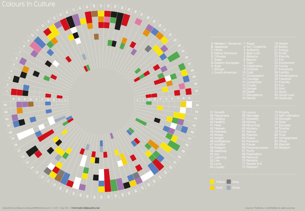
Colours in Culture (McCandless, 2009, page 76)
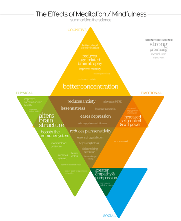
Meditation Evidence (McCandless, 2014, page 76)

Based on a True Story? (McCandless)
In addition to running his website and writing books, David tours the world training others on effective data visualisation. Here is a graphic from his book that gives an overview of his approach:
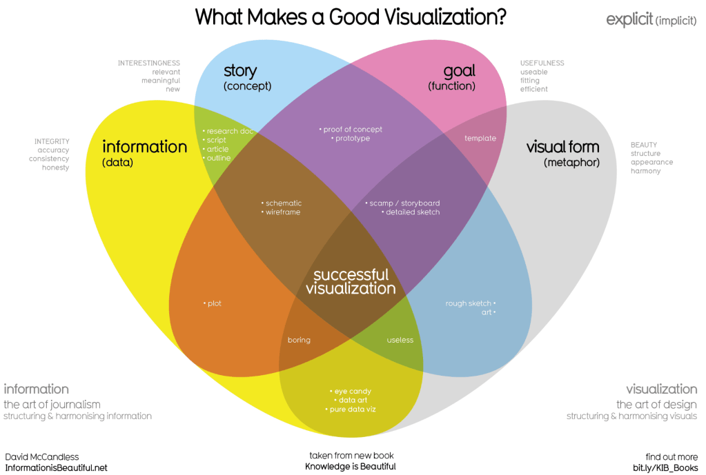
What makes a good visualisation? (McCandless, 2014, page 242)
Luckily for me, David is running a workshop in London on October 13th titled “Create Impactful Infographics” which I will attend. (And also got a massive discount on thanks to my student card!)
At the workshop I hope to get an insight on his process, learn some techniques, and find inspiration for my own data art pieces.
Stay tuned for a blog about the session…

Leave a comment