On Monday 13 October I spent the day at a data visualisation workshop run by David McCandless, who is one of the data artists I looked at as part of my research paper.
David’s mantra is that “Information is Beautiful” and has produced three books on the subject. He has become an evangelist for encouraging data visualisation to break out of the norms of pie charts and bar graphs, to make data engaging as well as informative. I was excited and intrigued about attending his workshop.
It was a full day from 09:30 to 16:30 at a hotel in central London. Luckily the cost was relatively low with my student concession price!
Roughly 120 people attended from various walks of life. Most seemed to be either working for a business or a media outlet that needed to produce engaging and effective data visualisations.
David McCandless presented for the whole day. Initially we discussed common goals for data visualisation:

It was interesting to discuss how data visualisation can really bring information to life.
Then we looked at the different types of data visualisation and why they were effective. There were so many examples!
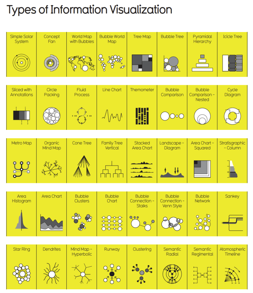
David is very much against the “typical” or “traditional” data visualisations and seeks ways to make data impactful in new and intriguing ways. His infographics are often amusing and cheeky.
For example this one about the “best dogs”:

He uses a combination of methods to convey different elements of data: colour, size, placement, and even direction that the dog is facing are all relevant.
Or this one showing the most common passwords:
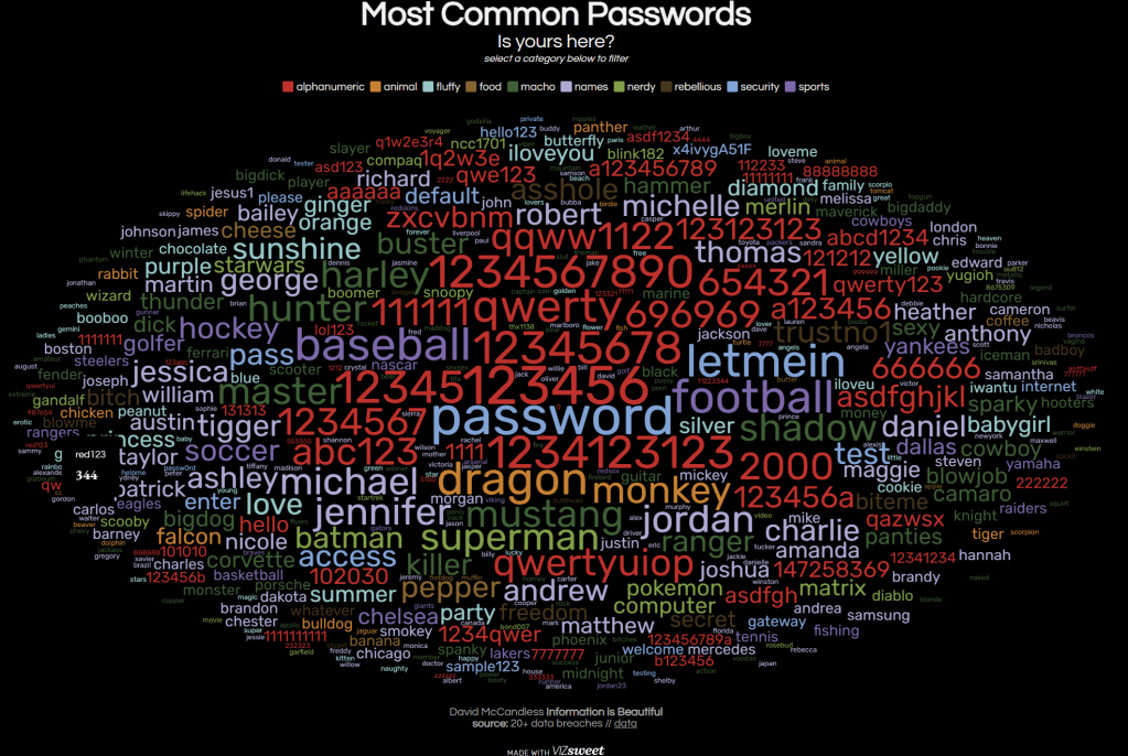
The different examples showed how many different ways that data can be represented.
We did some practical work during the course, that I will blog separately about, but I learned a lot about how to make the information interesting, informative, and hopefully beautiful.
It was a worthwhile day.

Leave a comment