Since doing all of the research into Data art, the time finally came that I actually needed to create my first piece of Data art with the new theme of covid related data.
I spent a long time looking at different types of data available online. Should I dive right in to number of deaths per country? No that seemed a bit much for the first piece.
Since I had already done a lot of work with the working from home data, I ended up coming back to that. I have the percentage rates of home working from April 2017 to March 2025, divided by the 12 regions of the UK including Northern Ireland. This set of data is relatively simple so seemed a good choice of where to start.
I thought a lot about how I would represent the data, firstly would it be linear or circular? Do I show the data for all twelve regions? Do I use the full dataset since 2017? There were a lot of things to think about. Ultimately I decided that I would use the full dataset.
The big question was HOW to express the information. Originally I wanted to have some kind of 3D effect and thought about stacking sticks of wood, but I worried that it might look like a Blue Peter project. Then I thought I would use layers of coloured acetate, thinking that the more layers there are then the darker the colour would be, so useful for indicating the level of the percentage. However I soon realised that this only works for about four shades of an individual colour before the difference between layers becomes too small to really notice. I considered using different coloured fabrics and almost went down this route, but ultimately I decided to treat this first piece as a test run, to prove the concept of the visual display of the data. Therefore I decided to use paint in different shades of blue.
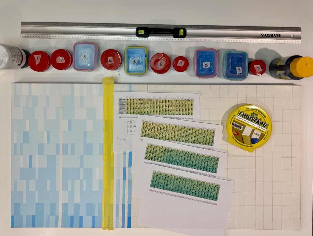
This turned out to be much more challenging than I expected. I needed to create twelve shades of blue that were distinct enough from each other so the naked eye can see the difference. Seems like an easy task but it took me so long. I spent about two weeks trying and failing to get the colour gradations that I needed. I had so many pots of different blues everywhere! If I found that a colour needed to be a little lighter or a little darker, it was a real challenge to made sure I didn’t add too much or too little additional paint. Otherwise, as happened frequently, the adjust colour became too close to the next one in the sequence.

Finally, after much frustration, I had what I thought would work. Now, I thought, I could get painting. Well no actually that wasn’t the next step.
The next step was measuring and marking the canvas to ensure that the colours would be even and make sense with the data. Eventually after a lot of work with rulers and pencil, I had it marked out so now I could get to painting. Well no again!
The next step was to prepare the data properly, so I knew which colour went with each data point. I mapped the colours to the different data ranges and printed out the spreadsheet of numbers to work with. Now surely I could start painting – well kind of.
To get the lines straight I needed to use a lot (a lot!) of painters tape to mark out the rectangles. Once this was done for a set of stripes, then I could finally start painting. It turned out to be a bit fiddly ensuring that I was using the correct paint colour for the correct data point. And unfortunately I counted the stripes incorrectly at one point and had to redo a set that I had already done.
The stripes needed to dry before I could do the next set, so it became a somewhat tedious process. However once I got into the swing of it, I eventually found it enjoyable but very long in production.
At this point I am only about halfway finished the piece but I hope to give an update soon with the finished product. Stay tuned…

Leave a comment