In November I started working on a new piece of art based on a dataset about working from home percentages in the UK since 2017. More is in this earlier post: https://sophieashdown.blog/2025/11/23/data-art-feeling-blue/
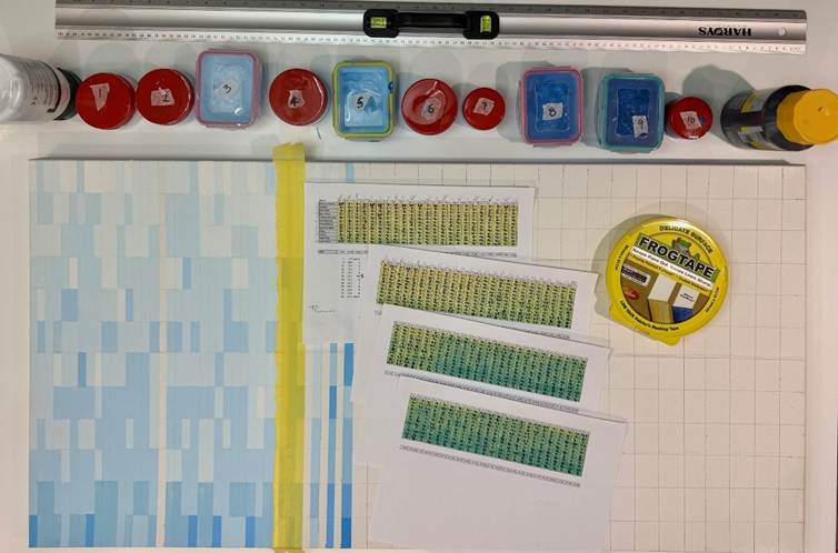
I wrote previously about how challenging and time consuming it was to select, analyse, and prepare the data ahead of making the art work. And then how long it was taking to actually paint over 1000 little rectangles in different shades of blue.
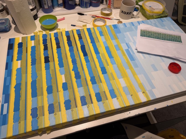
At the end of November it looked like this:
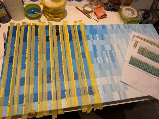
I worked on it over Christmas when I could at in January it was almost there:
It took far longer than expected to prepare the blocks for painting and then ensure that I was coordinating the correct colour with the relevant percentage.
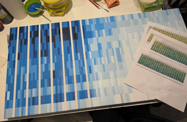
By the beginning of February the main painting was complete:
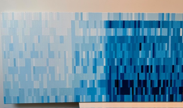
However there is some tidying to do and I accidentally got a couple of the columns mixed up so I need to go back and fix them to have the correct correlations, but it shouldn’t take long.
What strikes me now that I can look at it objectively, is how obviously the data trend is represented which I’m happy about, but feel that it would have been good to have more data at the tail end to see more of what is happening to the wfh percentages over time.
As a pattern artwork on its own, I think it stands up for itself. It would be interesting even if you didn’t know it was based on data. Does it have the impact I was hoping for? I’m not entirely sure. I need to sit with it for a bit.
One thing I have tried is to capitalise on how the collection of rectangles looks like office windows. I’d like to say that this was on purpose but actually it is a happy accident.
Although I don’t usually do anything figurative, I wondered how it would look if I inserted some figures into some of those “windows.” I had a go at just creating a quick few windows made from acetate, so that they can be added or removed as needed:
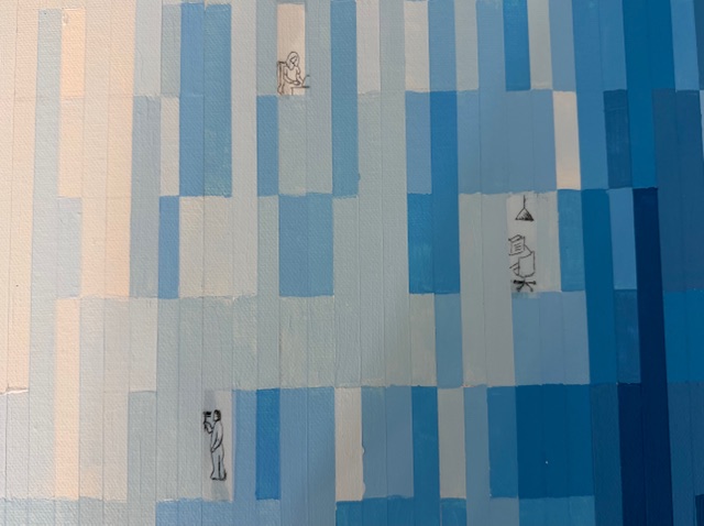
It’s not so easy to see but I did some quick sketches of a woman on her laptop, and empty deskchair, and a window cleaner. At this point they are just rough sketches to get an idea of how it could work so if I decide to include more then I will make them in better quality.
Do they work? Yes I think that better versions could work and would make an amusing commentary on the data topic. Would I keep them? That I haven’t decided yet. I’m not sure about mixing figures with my abstract data art. I don’t necessarily want to set a precedent, but maybe it becomes a “thing” that I incorporate into future pieces as well.
I’m currently working on a new piece with music data, that will kind of resemble a vinyl record, but only if you know what the data is about. I’m only in the data analysis phase so there is a lot of opportunity to lean into this idea harder or softer when it comes to physically creating it.
In the meantime I will finish touching up this blue painting and making some more “window scenes” so I can decide whether to incorporate them or not.
I seem to be in an exploratory period with this data art idea, and I’m getting more enthused about the possibilities as time goes on. Let’s see where it takes me.

Leave a comment