On 8 October I had the great privilege of visiting the Data Science Institute (DSI) at Imperial College London.
Gia had recommended it to me as a source of information and inspiration for part of my research project.
At the DSI they have an incredible feature called the Data Observatory. According to their website: “The Data Observatory (DO) is the largest open-source data observatory in Europe. Opened in November 2015, the DO provides an opportunity for academics and industry to visualise data in a way that uncovers new insights, and promotes the communication of complex data sets and analysis in an immersive and multi-dimensional environment.
Designed, built by, and housed within the Data Science Institute, the DO enables decision makers to derive new implications and actions from interrogating data sets in an innovative, unique environment. It was built in partnership with KPMG.” (https://www.imperial.ac.uk/data-science/facilities/data-observatory/)
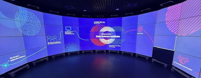
It is an incredible circular display of floor-to-ceiling screens that work together to showcase vast and detailed amounts of data visualisation, creating an immersive experience.
I was met by the lovely Gemma Ralton, Communications Officer for the DSI and also a PhD student. She kindly gave me an hour of her valuable time to demonstrate the Data Observatory and tell me more about what the DSI do.
Before visiting I had looked at the DSI website and seen photos of the Data Observatory (DO) so I thought I knew what to expect but standing in the middle of that room felt otherworldly. It was like being in a planetary observatory but for data instead of stars.
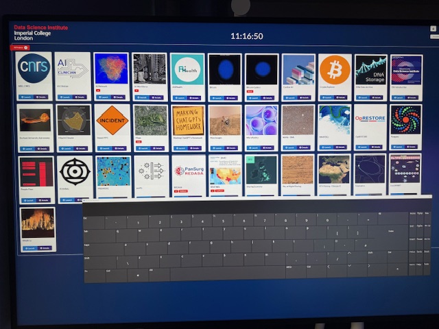
Gemma had a large iPad upon which she could select different examples to display.
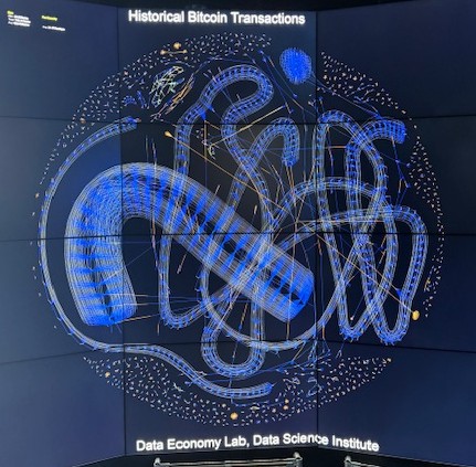
The first one we looked at was a live depiction of bitcoin transactions. It was a moving showcase of bitcoin wallets displayed as dots, with lines showing ingoing and outgoing transactions. It was a constantly moving kaleidoscope of colours and lines that spread across the whole DO.
We then looked at graphic depictions of cyberattacks on the bitcoin network that had happened in a single day:
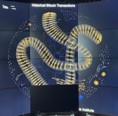
Apart from being quite alarming that there are so many attacks happening on the network, the resulting images are beautiful. Similar to looking at a cell through a microscope.
Gemma and I discussed the details of my research project and I talked about how it is based around data as a medium in art, and how the geometric elements of Constructivism are recurring themes in modern data visualations. She seemed to understand my approach and was particularly interested about the geometric elements. As we viewed further data visualisations, she could see these elements appearing again and again.
Later that afternoon Gemma was due to be hosting a session about how social media can be used to predict fires, which I thought was fascinating. We discussed how this might work and also discussed misinformation which is a key part of her PhD research.
We viewed this graphic that explains the difference between Misinformation and Disinformation, and how it relates to the fire predictions. Essentially misinformation is false information that is shared by mistake, and disinformation is false information that is shared on purpose with an intent to deceive.
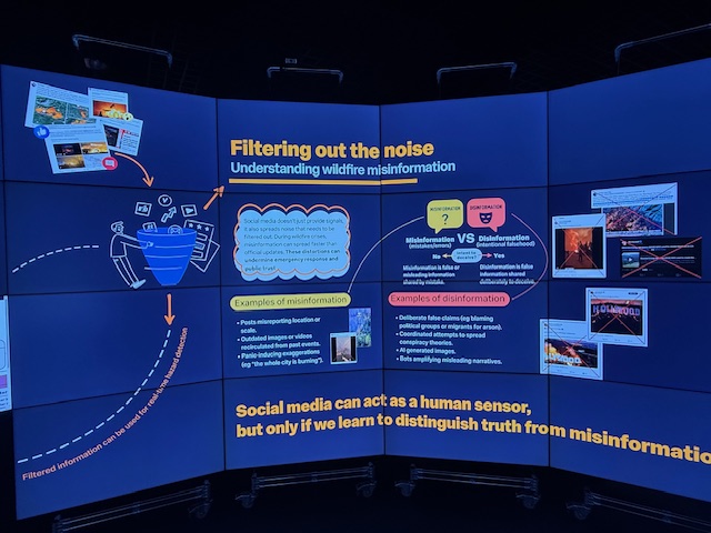
Up to that point I had not really considered misinformation as part of my research but of course I should be considering it. A piece of art based on data can only be as good as the data it is being based upon, so if that is incorrect then the intention of the art piece would be skewed. I will have to consider this in future projects.
Overall I had a fantastic time at the DSI. I loved seeing the data come to life and found the visualisations to be beautiful and fascinating. I think Gemma so much for sparing her time to show me this wondrous piece of technology.

Leave a comment