Last November for my end of unit assessment, I submitted a three minute video which I have talked about previously. I regretted how I made the video and in particular a poor joke about one of the pieces resembling a sphincter.
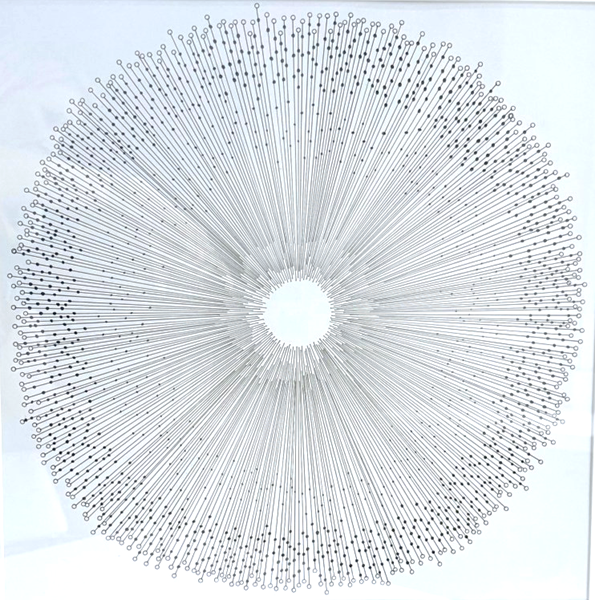
The piece in question was this one:
Ever since then, the piece has been sitting in my art room taunting me. Every time I looked at it, I would just cringe.
So I decided to have a go at updating it to see if I could reduce the “sphincter factor!”
Looking at it objectively, it is clearly the centre of the image that is the problem area. It was designed to draw the eye to the centre, as many of my pieces have been in the past. It was just bad luck that this particular one resulted in an unfortunate comparison.
I decided to mimic some of the patterns from the outside to the inside to see what would happen. I added loads of dots to the ends of lines in different sizes. Here is a close-up view:
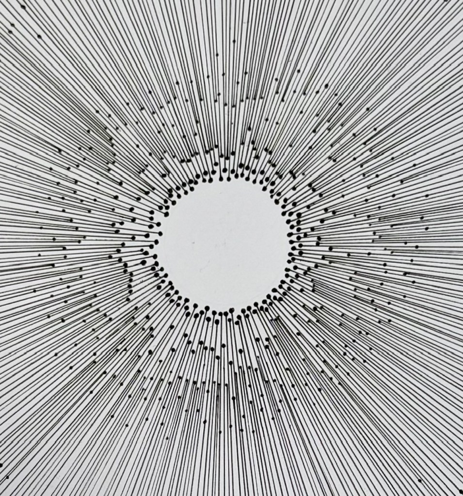
I quite like this close up view as it is, and somewhat wish that this was the whole image without the outer circle. I feel that this has an outer-space quality to it and does not remind me of any particular body part!
If you look at the above image for a while, it has a tendency to appear to be moving in front of your eyes, which I love.
However when zooming out to view the whole image:
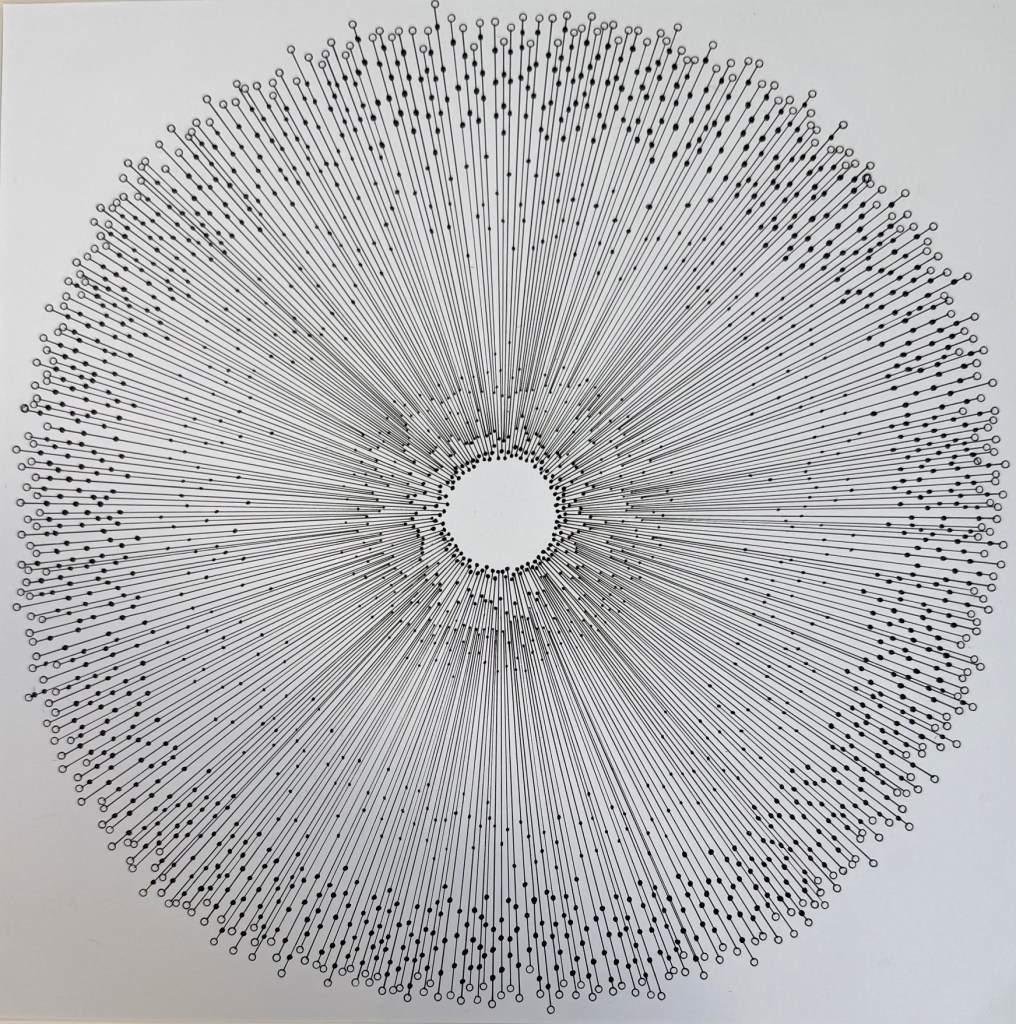
I fear now that I may have made it worse? Is it now just a hairy sphincter?!?
I am on the fence with this one, and was tempted to add yet more dots or lines, but then it was in danger of looking overworked.
For now I am chalking this one down to experience. I may decide to start again and make a whole new version and hopefully it will turn out better. In the meantime I still haven’t quite escaped this piece yet.

Leave a comment