Here is the summary of how I have achieved the learning outcomes of Unit 2. This post is long so if you want to view in Word format, a document version is here:
Learning Outcome 1 : Develop and realise a self-directed programme of learning which draws from wide-ranging subject knowledge. (AC Knowledge, AC Process) [Largely about your art practice – show how this has developed]
The progress of my art making during Unit 2 has had a profound effect on the direction that I’m heading with my practice.
At the end of Unit 1 in February I had already transitioned from creating large colourful abstract paintings on canvas to detailed pattern drawings in ink on paper. A couple of key things at that time are relevant to how my work has continued in Unit 2, and were not included in my assessment summary for Unit 1, so am including them here since I think they are relevant.
Artquest 30/30 challenge
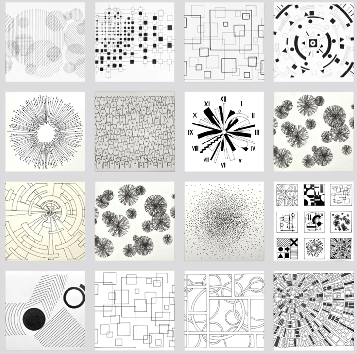
I did the Artquest 30/30 challenge in February during which I created an A5 size ink drawing every day for thirty days. It was quite transformational for me to really find the love of creating again, and feeling more accomplished as an artist. I could feel a new direction emerging and really enjoyed the process.
I summed up my feelings about the challenge here: https://sophieashdown.blog/2025/03/10/30-30-challenge-what-did-i-learn/
Key learnings about this challenge include:
- The structure and deadlines of the challenge gave me the motivation and routine that I needed to create consistently. Along with the fear of public failure!
- My mind opened up to inspiration the further the challenge went. Because I needed a new idea every day, I found myself naturally seeking out patterns and images around me for inspiration.
- Constructivist elements found their way into much of my work, whether consciously or not.
- Almost every piece needed more time than I had to give it, forcing me to realise that I really need to re-evaluate how I plan my time for creating.
- Working in ink taught me to embrace the mistakes, or find a way to hide them. This was freeing somehow because I could give in to the process.
Interim show piece – “Pattern of Patterns”
Preparing for and exhibiting at the Interim show was a pivotal moment. As the first big opportunity to exhibit with my coursemates, I wanted my contribution to be impactful and representative of who I am as an artist, or at least who I was at that moment. A synopsis of how I prepared for the show is here: https://sophieashdown.blog/2025/03/20/interim-show-piece/


Key learnings about the Interim piece include:
- The A5 pieces I made in the Artquest challenge originally formed the inspiration for the show piece, and then ended up becoming part of the piece instead.
- I was able to consciously evaluate all of the A5 pieces I had made up to that point to determine which ones truly fit with the direction I was going in.
- Devising how I would display multiple A5 pieces together ended up forming the overall piece itself. I constructed it using 30 different A5 drawings, black mounts, and jump rings. It took considerable time to work out which drawings worked best together and in what order. Despite my intentions to be more free with my art, I reverted to type and got very specific with how I wanted it to come together.
- Sleep is secondary to my practice since I decided at the last minute to create and add six (6!) more drawings, which meant I was up until 2am the night before hanging day.
- Ultimately I was proud of how it all fit together cohesively.
New Ink Drawings
From April I started making some larger ink drawings based on some of the A5 size pieces I had made earlier. My intention was to expand upon the work I had already created, essentially thinking of the A5 pieces as test drawings for which ones I wanted to make on a larger scale.
A summary about two of those pieces is here: https://sophieashdown.blog/2025/04/23/new-work/
The first is this one, titled “Seeing the Light”:

It was based on one of my Artquest A5 pieces:

I liked the shapes, lines, and optical effect of the original piece and tried to recreate it in a larger version. Unfortunately I was unhappy with the results of the larger version. I think that I made the lines too fine and too many, with not enough circles on both ends of the lines. Although there is a sense in the larger version of being drawn towards the centre, I can’t help thinking that it is more like a sphincter than a vortex, which is never good for a piece of art.
The other drawing is this one titled “Warp Speed”:

It is based on this A5 drawing:

With this piece, I chose the A5 version to build upon because I liked the combination of circular and straight lines, the shapes radiating outwards from the centrepoint, and the somewhat sci-fi feel of the piece. One thing I would change about the larger piece is the make the outlines of the circular pieces thicker so they stand out more. Currently it feels like they fade too much into the background so I will go back and fix these.
Key learning on these two pieces:
- Recreating something in a larger size does not mean it will be more successful than the original. The larger version can take on a new personality of its own.
- Scaling up from a smaller size may mean that you need to adjust the number and/or thickness of the lines.
- It is okay to go back and fix issues on an artwork even after you think it is “complete.”
- It’s never going to be perfect
New Constructivists Annual Show
I am part of the New Constructivists art group and we have an annual show in Spring every year. This time it was at the Chelsea Town Hall for the third year in a row.
More about the show is here: https://sophieashdown.blog/2025/04/24/new-constructivists-annual-show/

The show is held annually and has been at various locations around London but for the past three years it has been at Chelsea Town Hall. Most of the twelve artists in the group exhibit their work, plus we usually invite one or two other artists whose work reflects a Constructivist style.
I decided to slightly deconstruct my interim show piece into two sections, plus the two works referenced previously – “Seeing the Light” and “Warp Speed.” The show was quite successful in terms of numbers of visitors. The preview evening was very well attended and I talked to many patrons about my work. More on that here: https://sophieashdown.blog/2025/05/03/new-constructivists-private-view/
I had an “artist’s summary” statement on the wall next to my work which included that I am currently doing the MAFA at CSM. This garnered many questions and I found myself enjoying talking about the experience and the progress I am making. I feel that I have better ways to talk about my art and express myself as a result of the course, resulting in feeling more confident in myself and my art practice.
In preparation for the show I created the poster which I think turned out well:
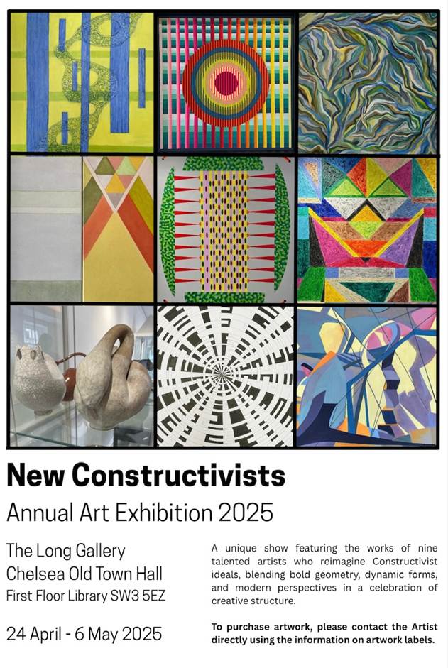
Although the poster is not exactly a work of art in the usual sense, it is still a creative output that I’m proud of. I actually got quite a few positive comments about the poster and someone even asked if they could take one home because they wanted to put it on their wall.
Key learnings from the New Constructivist show:
- My CSM interim piece fit perfectly in the theme of the show, and further expresses my natural gearing towards the geometric aesthetics of Constructivism.
- The two new works created for the show fit well with the theme and were well received.
- Since starting the course, I feel more comfortable and confident talking about my art practice.
- Making the poster was surprisingly enjoyable and I was pleased with the outcome.
First Foray into Data Art
Since my research project is about Data as a material in art, I decided to start making some of my own art based on data. My first piece, “Life of Pi”, is discussed here: https://sophieashdown.blog/2025/05/29/life-of-pi/
In the blog I talk about the different types of data sources that I considered before making the first piece, including music data or number sequences like the Fibonacci sequence. I settled on the number Pi, which has infinite digits:
3.1415926535897932384626433832795028841971693993751…
I spent time considering how I could visually portray this number and decided on a monochrome ring of circles:
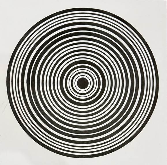
Each number in the sequence is represented in millimetres separated by a standard gap of 5mm. Therefore the central dot is 3cm in diameter to represent the number 3, then a 1mm width circle for 1 and a 4mm width circle for 4, etc. I only stopped with the circles when I got to the edge of the paper, but theoretically I could keep going with the rings infinitely if I had enough paper!
I really enjoyed the process of creating this piece because it spoke to key aesthetics that are important to my practice – monochrome, clean lines, hand drawn ink, pattern, precision, and a nod to Constructivism.
Completing the piece also gave me confidence that data can indeed be a medium in art, and hopefully I was going down a meaningful track with my research.
Key learnings from this piece:
- Demonstrated to myself that data is a valid material in art and that I can successfully create my own version of Data art.
- Considering and deciding on what data to use took much longer than I expected, as did devising exactly how I would translate the data into art.
- Completing this piece gives me more confidence in the validity of my research project and the direction my art is going
Deciding on the path for my data art
Conducting the research for my paper gave me a lot of insight into the world of data visualisation and data art. Surprisingly there are not many well known data artists out there. I had to really hunt for them. I struggled to find a lot of information or advice on how to forge ahead with the idea of using data in my art so I’ve had to do a lot of thought, research, and introspection to find the way forward.
Once I knew that I wanted to use data, I had to decide what type of data. I felt that it needed to have a theme that people would recognise and connect with, and that had a wide scope of opportunity for me to use in different ways.
In this blog I first consider some different types of data: https://sophieashdown.blog/2025/07/28/data-as-a-medium/
The types I considered included:
- Music data – I work for a music licensing company and have access to a wealth of interesting data, so this was a strong contender
- Animal welfare – this is close to my heart having been a vegan for over half of my life. There is a lot of data available on this subject but it can be quite a sad and depressing topic and I wasn’t sure that people would want it on their wall
- World records – this might seem like an odd choice but there is so much data available and people find it interesting. Ultimately though I thought it might be a bit gimmicky
- The Environment – certainly there is a huge amount of data out there for this and everyone knows and recognises it. However I thought it was potentially too large of a topic and also one that has been done a lot in many ways.
Ultimately I didn’t go with any of the above ideas but it was useful to consider and evaluate them, among others.
In this blog I considered how I might translate the data into artistic format: https://sophieashdown.blog/2025/09/10/exploring-data-options/
At this point I hadn’t fully decided what data I was going to use, but I had downloaded a lot of data about home working from the Office of National Statistics (ONS.) The question was now that I had the data, how was I going to make it into a beautiful and engaging piece of art. It turned out to be harder than I thought.
I put the data into Excel and used some of their standard charting tools to see if I could find inspiration, and it did help me to understand different ways to show the data but none that I felt were translatable. Probably the most attractive one was this:

Without the horizontal lines, the different coloured dots do form an intriguing and attractive pattern. Ultimately I didn’t use any of the Excel ideas but it was helpful.
Data Art Theme – a decision!
After much research, testing, deliberation, and discussion with my long-suffering partner, I decided on the data theme for my art, which essentially is data affected by Covid. The main reasoning being that every adult today remembers the impact the Covid had on their lives and the world, there is a wealth of data about it, and it had huge impacts that show in the data. Further detail on this is here https://sophieashdown.blog/2025/11/15/data-art-theme/
There are a wealth of different directions to take the data, many of which will grow with time as the long term impact of Covid is felt. I already have a list of potential topics related to covid, from the serious to the more light-hearted, including:
- Public transport usage
- Air quality / pollution levels
- Online deliveries
- Unemployment figures
- Service industry impact – eg hairdressers, nail salons etc
- Public transport usage
- School attendance/absenteeism
- Mental health services
- Pet adoptions
I am happy and excited about the possibilities for where my art will take on this basis.
Key learnings from research into data themes:
- The theme needs to be relatable, engaging, interesting, and wide ranging
- It is harder than I expected to find a theme that would work
- Excel is helpful in figuring out how you don’t want to display the data
- There is a LOT of data out there and it takes a long time to evaluate it
- Covid related data is highly engaging and amply available
First piece of Covid related data art
So the time finally came that I actually needed to create my first piece of Data art with the new theme of covid related data. I’ve detailed the start of this project here: https://sophieashdown.blog/2025/11/23/data-art-feeling-blue/
After some deliberation I decided to use the data about home working percentages across the UK. As you’ll read in the blog, it was not an easy process. I underestimated how long it would take to review the data and work out how to break it into specific data points that would be usable in the art. I spent a fair amount of time deciding the method I would use to display the data, and eventually decided to just paint it for the first version. This meant spending huge amounts of time getting the colours just right, and now I am in the process of actually painting the piece. It is a work in progress but I think it will be good once it is finished.

Key learnings from my first Covid data art:
- Don’t underestimate how long it will take to research and select the data set
- Don’t underestimate how long it will take to prepare the data
- Don’t underestimate how long it will take to figure out how to display the data
- Don’t underestimate how long it will take to make twelve shades of one colour
- Don’t underestimate how long it will take to paint 1152 rectangles
Learning Outcome 2:
Articulate a thorough understanding of your research and establish an informed critical position. (AC Communication) [Learning Outcome 2 – is largely about your research paper and all the different elements of research that connect to it]
For reference, my research topic is:
Data as a raw material in art. How contemporary data artists echo the Constructivist use of geometric forms by treating data itself as the modern equivalent of an industrial material, comparing specifically how Artist Nathalie Miebach and Data Journalist David McCandless incorporate the design elements of Constructivism in their artistic interpretations of data.
Conducting my research and writing my research paper took me on a wide course of learning, investigation, consideration, amazement, frustration, and a few mistakes along the way, but I feel that ultimately I am proud of what I produced.
I have since continued to think about and write further notes about the topic. Had I had a higher word count to work with, I would surely have hit the maximum for that too.
First step – deciding on my research topic
From the outset of considering what I might do my research on, I knew that I wanted to have an aspect of Constructivism included. This art movement has been key to my art practice for many years, and there are not a wide number of modern practitioners, so I wanted to continue to represent for this style.
In this blog write I considered my approach and some possible ideas: https://sophieashdown.blog/2025/05/01/research-ideas/
Our designated librarian, Ben, joined us for a Tuesday session and took us through how and where to find resources for our research. This was a really useful session because I could use the tools to quickly find a wealth of resources.
Looking back on that post from 1st May, I had already identified that I am interested in potentially researching something that combines technology and Constructivism, which is not far from where I ended up.
At one point I centred on an idea that I thought would be really interesting and started gathering information about it. I had been talking to a friend who is a psychotherapist and we started talking about personality types. I then had the bright idea to consider whether an artist’s personality type influenced the type of art they made. Details about this are blogged here: https://sophieashdown.blog/2025/05/12/research-topic-failure/
Typical me, I barrelled forward talking to my artist friends and canvassing some of my artist whatsapp groups to find out their personality types, based on the Myers-Briggs system. I was having a great time collecting the data and starting to map the personality types with the type of art. As I was doing it I realised that I was getting excited by the data, and wondered whether the art was being sidelined.
After an email exchange with Jonathan, who didn’t specifically tell me not to do this idea, I realised that it was not going to give me the artistic and academic learning that the research paper is supposed to provide. So back to the drawing board!
My next step was to take a more analytical approach to deciding my research topic by looking at what interests me. I talk about that process in detail here: https://sophieashdown.blog/2025/05/18/research-topic-getting-closer/
I made lists of :
- What are the core components of Constructivism that interest me
- What have I been inspired by recently?
- Key things outside of art that I’m interested in
This was a helpful process because I could work out where there was some crossover between these lists. I realised that it is important that I’Lm doing research on something that I’m truly interested in and can get excited about.
I had recently been looking at data visualisation through a book called “Information is Beautiful” by David McCandless. This led me to look for Artists who base their art on data, and although there were not many out there, I was mesmerised by Nathalie Miebach’s work based on weather data.

This really helped me to direct my thoughts and efforts towards the path I would eventually decide. The research topic idea of Data as a medium in Art was born, if not finalised.
Key learnings about deciding on my research topic:
- The number one thing I realised in the long run is that I need to be excited and interested in my own research topic. There is no point in spending that much time on something I don’t get excited to talk about. (My poor partner knows a lot more about Constructivism and Data Art than he ever thought he would!)
- I am easily distracted by doing research! Many times I went down a rabbit hole on a particular topic, even if I didn’t end up using it. But that’s okay, it was useful to know what I didn’t want before decided what I did want.
- Keep the topic focussed on the art. I went too far down the idea of the personality types but did eventually realise that it was taking me off course. It was useful to know that I could recognise it and reset.
- It’s okay to combine the technical side of my brain with the artistic side, as long as ultimately it is still focussed on the art.
Research Tutorials
I was lucky to have Gia as my research tutor. I find her easy to talk to and very encouraging. We had some great tutorials where she guided me on resources to review and ideas to try. I found her to be very supportive and gave me confidence in the direction I was going. The following blogs describe the sessions I had with Gia:
Key learnings from working with Gia:
- My ideas are valid even if I don’t use them all in the research.
- It’s okay to adjust my research topic along the way, as I learn more through the process.
- In my draft versions, it’s useful to use bullet points in sections to note what I want to say in the different sections, to be expanded upon later.
- Top tip from Gia was to use “TK” when writing to note places where I need to add or update something later if I couldn’t quite think of the correct word or phrase at the time of writing. It helps keep the flow of thought going without getting interrupted. This was super useful and I used it a lot.
- Gia is a really lovely person who is great to talk to. I can imagine spending a really fun evening with her and a bottle of wine. We would have some great discussions and a lot of laughs.
Research process
Before I started doing any work on the research paper, I was admittedly apprehensive about it. I thought that the research would be tedious and I wouldn’t enjoy it. Well I surprised myself by how much I enjoyed it and really got into it. Sometimes I got too into it and spent hours doing deep dives into different artists, art movements, and other topics that I found fascinating. I read many books and spent hours online searching, reading, and learning.
The main part I didn’t enjoy was doing the citations and bibliography, but with Jonathan’s recommendation of using Zotero, this was much easier than it might otherwise have been.
Certainly I spent more time researching than writing, but then I found when I was doing the writing that I had plenty to write about. I could have written far more than the max 4000 words would allow. Gia suggested that I could potentially write a book about Data art which I initially scoffed at because who am I to write a book?! But since then it has got me thinking about it. Eventually I wrote almost 4800 words so I spent the day before the paper was due running through it to see what I could cut out or condense. I suppose that is better than not having enough words!
Along the way I blogged about specific areas of research that I was doing.
This blog talks about Constructivism. https://sophieashdown.blog/2025/08/10/research-constructivism/ I talk about the work I did to describe and explain Constructivism in the context of the research paper. There is so much information about Constructivism and yet it is not widely known outside of artistic circles. Most people of any background have heard of and know about popular art movements like Impressionism or Cubism, but not so much Constructivism. For myself I am most interested in the later stages of Constructivism after they shed the propaganda posters and focussed more on the geometric aesthetics.
This blog describes the artists I researched for my paper and the questions I wanted to ask them since they are both still alive. There is more information about Nathalie Miebach than David McCandless in this blog because I had been focussing more on her at the time but mentions both. https://sophieashdown.blog/2025/09/03/research-questions-for-my-artists/ I wanted to find out more about their personal journeys as artists and get their perspective on data as a medium in art. Ultimately I did get the questions answered by David McCandless, but despite three emails to Nathalie Miebach I did not get a response.
Gia, my research tutor, suggested that I go and visit the Data Observatory at Imperial College London’s Data Science Institute. https://sophieashdown.blog/2025/10/10/research-data-science-institute/ I was luckly enough to be given an hour of time by their Communications Officer, Gemma Ralton, and it was fascinating. The Data Observatory is an enormous circular screen that displays incredible data visualisations. It was very inspiring and I had some fantastic conversations with Gemma. Ultimately I did not include a section in my research paper about this visit, but it did give me some ideas about my own Data Art.
Since I had written quite a lot about Nathalie Miebach in my post about questions for my artists, I wanted to blog about David McCandless. https://sophieashdown.blog/2025/10/12/research-david-mccandless/ He is arguably one of the most famous data visualisation experts in the world. He has written three books about data visualisation, has a very active website that is a font of information, and tours the world doing talks and giving workshops. His work is very inspiring and in particular I love his mantra that “Information is Beautiful.”
In October 2025 David McCandless ran a data visualisation workshop for a day in London, and I was lucky to attend at a much reduced price thanks to my student card. https://sophieashdown.blog/2025/10/15/research-data-visualisation-workshop/ It was a really insightful day of learning different ways to interpret data and how to visualise it. I was lucky enough to get some one-on-one time with David and we had a great conversation. He was very interested in my plans for creating my own Data Art, and we talked about the differences between it and Data visualisation. He feels that both are forms of art, and he strives to make his work visually appealing. It was a very useful day and I can use some of what I learned in my own art going forward.
Key learnings about my research process:
- Remember to keep writing things down as I do the research
- Use Zotero for tracking my bibliography
- It’s okay to write too much but remember that means you’ll have to cut it down later
- The research would be much more enjoyable than expected
- Try not to get lost down rabbit holes of research
- Think about writing a book about Data Art!
Learning Outcome 3:
Analyse and critically reflect on your practice and its context. (AC Enquiry) [Learning Outcome 3 – is largely about your reflective thinking and writing on your blog]
Pattern Walks
During the Easter break between Unit 1 and Unit 2, I started doing what I called “pattern walks” where I would go for a walk and photograph interesting patterns that I came across, both man-made and natural. I had realised that I my eyes are naturally drawn to patterns in everyday life, usually without realising. I tend to think in patterns and my art is all about patterns, so it makes sense that I seek them out.
Here are some blogs about various “pattern walks”, including one on a beach in Australia where the plant life was fascinating:
Key learnings from the pattern walks:
- Patterns can appear anywhere, both man-made and natural
- Taking the time to be purposeful about looking for patterns vastly increases the number I see, and also seems to improve my perception even when not specifically looking for them
- I take inspiration from the patterns around me and incorporate them into my work
Galleries and Art Shows
Going to galleries and art shows always piques my interest and inspires my own creativity. Here are some examples…
During the residential week in March, we went to the ICA and Tate Modern. https://sophieashdown.blog/2025/04/05/ica-and-tate-modern/
I found many pieces at both interesting and inspiring, but it was the Electric Dreams show at the Tate Modern that really struck me. The exhibition showcased a large number of artists and artworks inspired by science and technology.
Of particular interest was a piece by Gunther Uecker (b 1930) who created a piece in white on board of hundreds of nails also painted white. There was something about this piece that gave me an idea for something I can do in the future using a similar structure but with different materials. Hopefully I will be utilising this with some data art very soon.

I enjoyed the show so much that I went back again with my partner in May to see it again. I re-discovered some pieces I saw before and saw some that I found new appreciation for. Amongst the pieces were some Constructivist inspired pieces by Vladimir Bonacic (1938-1999) from Serbia who created some early computer generated pieces in 1969
In June I was in the Australian town of Sorrento, about an hour east of Melbourne, where I visited an incredible gallery showcasing Aboriginal art. https://sophieashdown.blog/2025/06/29/aboriginal-art/
Having lived in Australia for a total of five years, I knew that I have admired and been inspired by Aboriginal art for a long time. I have had people ask me previously if my own work was related to Aboriginal art to which I can say yes. I love the patterns, the application of paint, the mix of colours, and especially the sense of movement that these paintings evoke.
In September I went to the British Art Fair at the Saatchi gallery. https://sophieashdown.blog/2025/09/29/british-art-fair/
I have been before but this time I particularly wanted to visit to see their new section dedicated to what they called “Digitalism.” I was hoping that I might see some data-related art but most of the works were either AI generated or purely digital in display. It was still interesting and inspiring though. There was one piece in particular that I liked, partly because of the somewhat data-related element of words on the piece. I chatted to the artist for quite a while and ultimately commissioned him to create for me a monochrome version which will soon be hanging in my hallway.
Key learnings from visiting Art shows and galleries:
- Ideas can come from anywhere, and it’s okay to take inspiration from other artists.
- If I really like a show then it is worth going back again
- Speaking directly to artists can expand both your horizons and your network
May Tutorial with Jonathan
In May I had another tutorial with Jonathan, and as before, he managed to ask me about specific details that made me think for a long time, both in the session and afterwards. https://sophieashdown.blog/2025/06/04/may-tutorial-lining-things-up/
One of the things we talked about was that I had expressed an interest previously in trying to be more free with my art, because I tend to get so detailed. Jonathan asked if I really wanted or needed to, and I realised that the answer is no. I’m an artist that works in details and patterns, so it doesn’t lend itself to being very “free” with my art and I’m okay with that. It is what makes me who I am as an artist, even if it means that my pieces tend to take a very long time to make.
We discussed my research paper and where that is heading, plus how I’m getting on with Gia, which is great.
Coming out of a session with Jonathan always makes me feel more confident about the direction I’m going in, which I truly appreciate, even if there are some tough questions along the way.
Key learnings from my tutorial with Jonathan:
- It’s okay to be detailed and specific about how I create my art. That’s what makes me who I am as an artist.
- My research paper is on the right track
- Jonathan is a wizard with somehow building my confidence by asking questions that make me think in a lateral way
VAA session
In September I attended an online session run by the Visual Arts Association (VAA) of which I have been a member since 2018. It is a very well run group that puts on a lot of events and workshops. The best part is that membership includes Public Liability Insurance which you have to have to exhibit publicly.
The workshop was titled “Thriving as an Artist” and had three guest artists contributing. More detail is here: https://sophieashdown.blog/2025/09/27/vaa-session-thriving-as-an-artist/
I always find it valuable to learn what other artists are doing and how they do it. It is always an opportunity to learn. This was a good session with some good real-world insight that I can use for my own art practice.
Key learnings:
- It is valuable to take time to learn from other artists. Often they struggle with the same things you are struggling with.
- The advice from the artists was particularly meaningful. The most useful for me included:
- Prioritise time in the studio. (Keep making art!)
- Be social, have discussions with others about your art. That is often where ideas and opportunities come from.
- Go to exhibitions, see what other people are making. Get inspired.
- Social media is your friend for marketing. Understand how each can help you. Instagram, Facebook, X, Threads and even LinkedIn all have their place.
- Follow galleries and art journalists. Interact with their posts and engage with them. There is a much higher chance that they will notice you that way.
Wonder and Inspiration
Apart from the patterns I see everywhere around, as already mentioned, there are other sources of inspiration that influence my work, some of which I blogged about.
The pattern of a music poster had me fascinated: https://sophieashdown.blog/2025/06/11/music-mind-map/
The variety of shapes, colours, sizes, and patterns of cactuses can provide inspiration:https://sophieashdown.blog/2025/10/28/the-cactus-incident/
Nature continues to create incredible works of art and wonder, such as the Caves of Nerja: https://sophieashdown.blog/2025/11/05/cueva-de-nerja/
Key learnings from finding inspiration in unusual places:
- Patterns are everywhere
- Inspiration can come from any source
- Nature is an incredible artist
